
Portfolio Website
A showcase of my personality and skills.

PHP

HTML

CSS

JavaScript

SQL
My website’s gone through some major iterations, from clunky, to rough, finally to polished now. Below, I’ll highlight the last major design version changing into the current iteration. You can slide between the old and new designs using the interactive slider below.
About Page
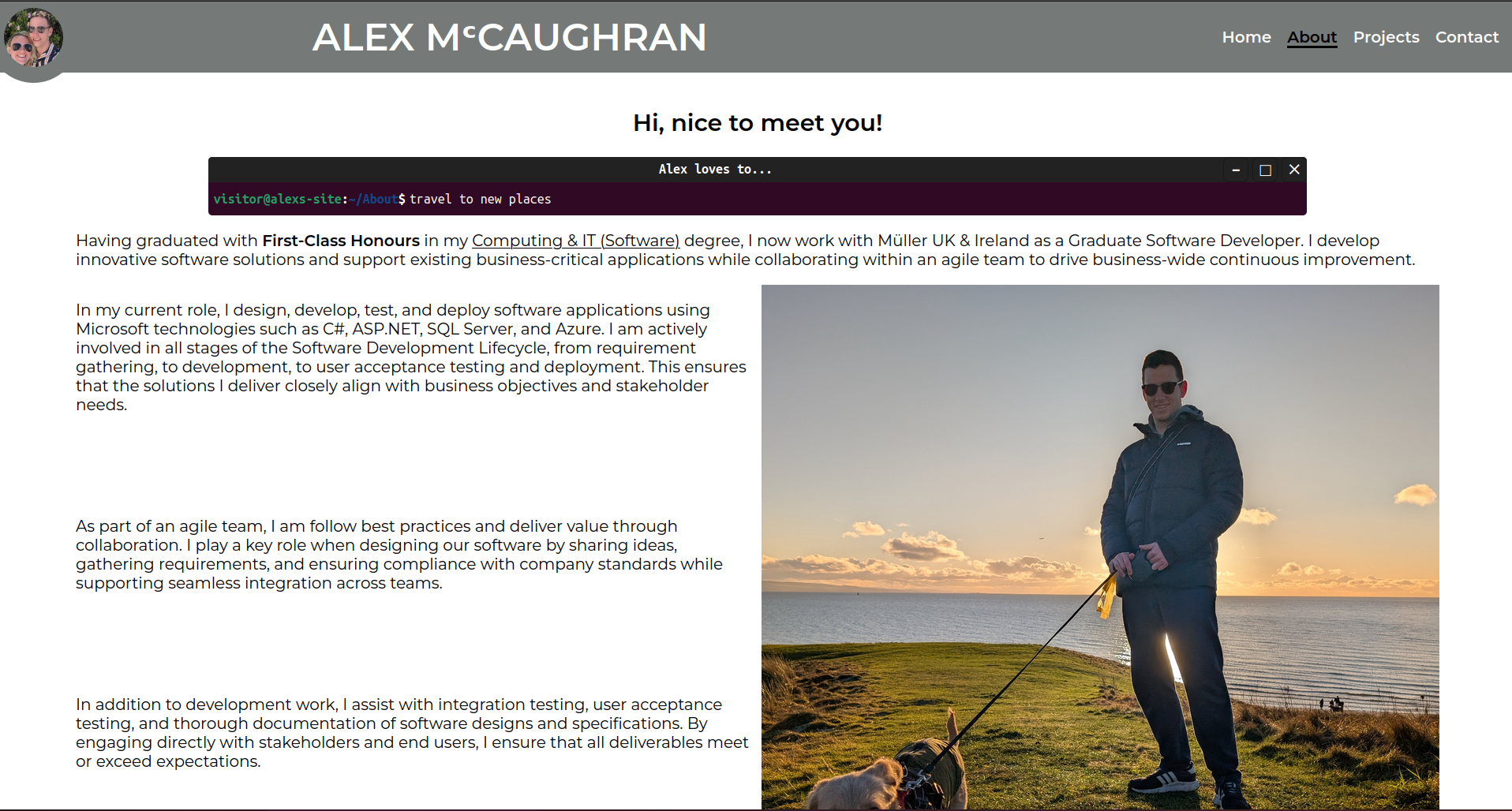
Not getting into the crazy-long wordiness of my previous site (which must must done the job somewhat, considering the fact hat it helped land me a grad job!), the design itself was so plain and outdated. It didn’t scream out “capable developer with an eye for design”, which I like to think is what a fair review of Alex McCaughran would say!
Projects Page
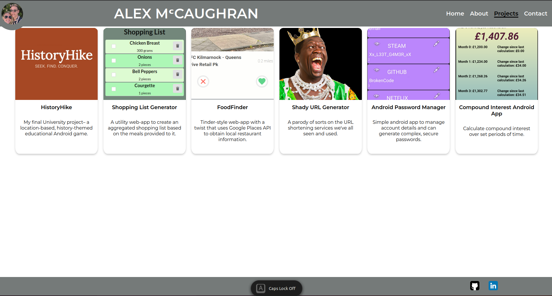
The old Projects page displayed a set of cards summarising my work. Each card contained a title, an icon or image, and a short description. Projects ranged from HistoryHike—a location-based educational Android game—to a Shopping List Generator that creates grocery lists from selected meals. Other highlights included FoodFinder, a Tinder-style web app built with the Google Places API to discover restaurants; the tongue-in-cheek Shady URL Generator; an Android Password Manager for generating secure credentials; and a Compound Interest Calculator for tracking investment growth. It was functional but lacked the polished design and interactivity of the current site.
Showcase Pages
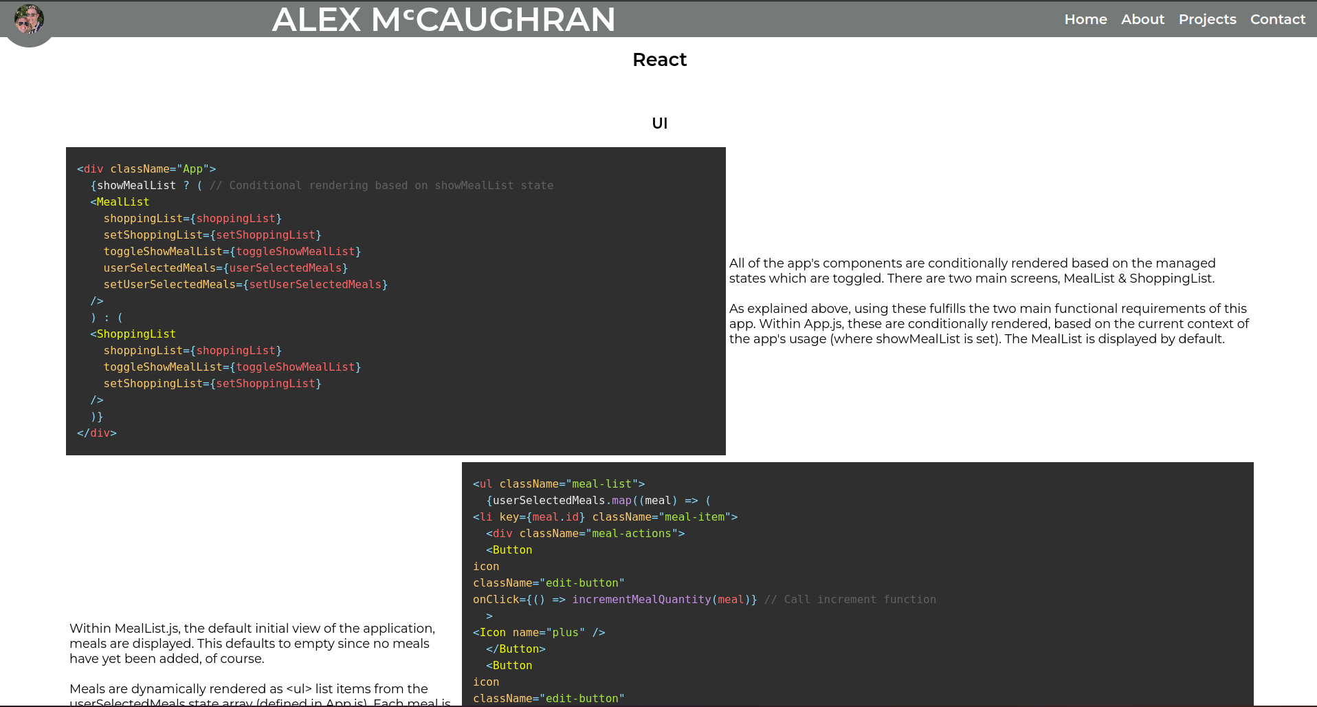
The old showcase pages presented code snippets alongside descriptive text in a fairly static layout. For example, the React showcase page walked through a Meal List application: conditional rendering switched between MealList and ShoppingList views based on state, and lists were generated dynamically from user selections. While informative, these pages were mostly static screenshots and prose, without the immersive, interactive demonstrations you’ll find in the new showcase pages.
Terminal
This component tells you a bit about how I like to spend my time, in an interesting way. It mimics a Linux terminal interface by using HTML, CSS, and JavaScript to achieve a dynamic, interactive experience. An array of strings are defined, which describe some of my hobbies, like below:
const stringsArray = ["develop interesting code", "do jiu jitsu", "play guitar", "listen to podcasts" ,"learn new skills",
  "go bouldering", "get lost in a good story", "travel to new places",
  "solve problems", "drink coffee"];
These are then shuffled randomly, so that each page load shows some different ones, giving a different flavour of me very time!
The terminal component is a simple but effective way to showcase my personality. It’s a fun, interactive way to show visitors what I like to do in my free time. It’s styled after something every dev has seen a million times: the default Ubuntu terminal.
The typing effect is driven by a small JavaScript function that cycles through an array of strings. It prints each string character-by-character into the terminal output, pauses briefly at the end, then deletes the text one character at a time before moving to the next string. Timing intervals control the speed of typing and deletion to mimic a human typist. The function also checks whether the terminal is visible in the viewport—if the user scrolls away, the animation pauses until the terminal comes back into view—ensuring smooth performance and avoiding unnecessary work.
// Function to handle typing and deletion
function handleTyping() {
  if (!isElementInViewport(outputElement)) {
      // Pause if not in viewport
      animationPaused = true;
      // Mark if we were in the middle of deleting
      if (isDeleting) {
          deletionWasInProgress = true;
      }
      return;
  }

  if (animationPaused) {
      // Resume the animation if it was paused
      animationPaused = false;
      if (isDeleting && !deletionWasInProgress) {
          // If we weren't in the middle of deleting, pick up the next string
          currentCharIndex = 0;
          isDeleting = false;
          currentIndex = (currentIndex + 1) % stringsArray.length;
      }
      deletionWasInProgress = false; // Reset flag as we are resuming
  }

  if (isDeleting) {
      // Delete characters
      if (outputElement.textContent.length > 0) {
          outputElement.textContent = outputElement.textContent.slice(0, -1);
          setTimeout(handleTyping, deletionSpeed);
      } else {
          // When deletion is complete, reset flags and proceed to next string
          isDeleting = false;
          deletionWasInProgress = false;
          currentIndex = (currentIndex + 1) % stringsArray.length;
          setTimeout(handleTyping, pauseDuration);
      }
  } else {
      // Type characters
      if (currentCharIndex < stringsArray[currentIndex].length) {
          outputElement.textContent += stringsArray[currentIndex][currentCharIndex++];
          setTimeout(handleTyping, typingSpeed);
      } else {
          // Start deleting after typing is complete
          currentCharIndex = 0;
          isDeleting = true;
          setTimeout(handleTyping, pauseDuration);
      }
  }
}
handleTyping is configurated from a main function, which co-ordinates things like:
- where to type
- how fast to type characters
- how fast to delete characters
- how long to pause between typing and deleting.
It also ensure that the typing stops when scrolled out of view. Otherwise, long messages end up pushing the content below down, which looked bad on smaller screens.
Work Timeline
Each icon on my work timeline is wrapped in a <div>, which contains a date range for each data point. This div has a tooltip child, containing details of each career stage. This tooltip is hidden at first, but an event listener waits for the mouse to enter over these divs, then applies a class to the tooltip which makes it visible. This is fairly simple stuff so far, but the below javascript also accounts for the size of the screen and position of the parent div then positions the tooltip relative to both. This ensures that the tooltip info is always visible.
document.querySelectorAll(".event").forEach((event) => {
  const tooltip = event.querySelector(".tooltip");

  event.addEventListener("mouseenter", (e) => {
    const rect = event.getBoundingClientRect();
    const tooltipWidth = tooltip.offsetWidth;
    const tooltipHeight = tooltip.offsetHeight;

    const tooltipX = rect.left + rect.width / 2 - tooltipWidth / 2;
    const tooltipY = rect.top - tooltipHeight - 10;

    tooltip.style.left = `${Math.max(0, tooltipX)}px`;
    tooltip.style.top = `${Math.max(0, tooltipY)+100}px`;
    tooltip.style.opacity = "1";
    tooltip.style.visibility = "visible";
    tooltip.style.transform = "scale(1)";
  });

  event.addEventListener("mouseleave", () => {
    tooltip.style.opacity = "0";
    tooltip.style.visibility = "hidden";
    tooltip.style.transform = "scale(0.9)";
  });
});